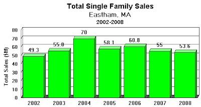
The first graph shows the total value (in $M) of the single family homes sold in Eastham. It shows, fairly dramatically, when the slowdown began. The good news for Eastham is that, although volume decreased about 30%, the home prices did not.
The next graph shows current active single family homes in the context of the last 2 years. You'll see that inventory is decreasing. Time will tell us whether this is real or just a slow month in a normally slow season. It could be the beginning of a more balanced marketplace, caused in part, by renewed buying encouraged by the record low mortgage interest rates.


No comments:
Post a Comment